Designing a personalized monogram wedding wine label in four sizes, two layouts, and one stubborn vision.
There’s a frustration that designers know well. You can see the finished thing in your head. The font is the right weight. The gold filigree wraps around it. The names sit perfectly below.
Then you open the file, and what’s on the screen is not that. Close, sometimes. Often not even close. And you can’t let it go.
That was this label.
A Single Letter
The design started with a single letter doing all the work in the middle of an ornate frame. Sounds simple. It wasn’t.
Almost every font I tried killed the elegance the moment it landed inside the filigree. Too heavy and the K turned into a logo. The romance went out of the frame. I lost count somewhere around font twenty. Each one a little wrong in a slightly different way.
Eventually I landed on Warbler. Weight without thickness. The bowl of the K balanced the diagonal leg in a way that felt elegant. Then came the second-guessing. You know, the am I settling because I’m tired, or is this actually it? I closed the file, looked at it the next morning with a fresh cup of coffee and I still loved it.
Two Ways to Wear It
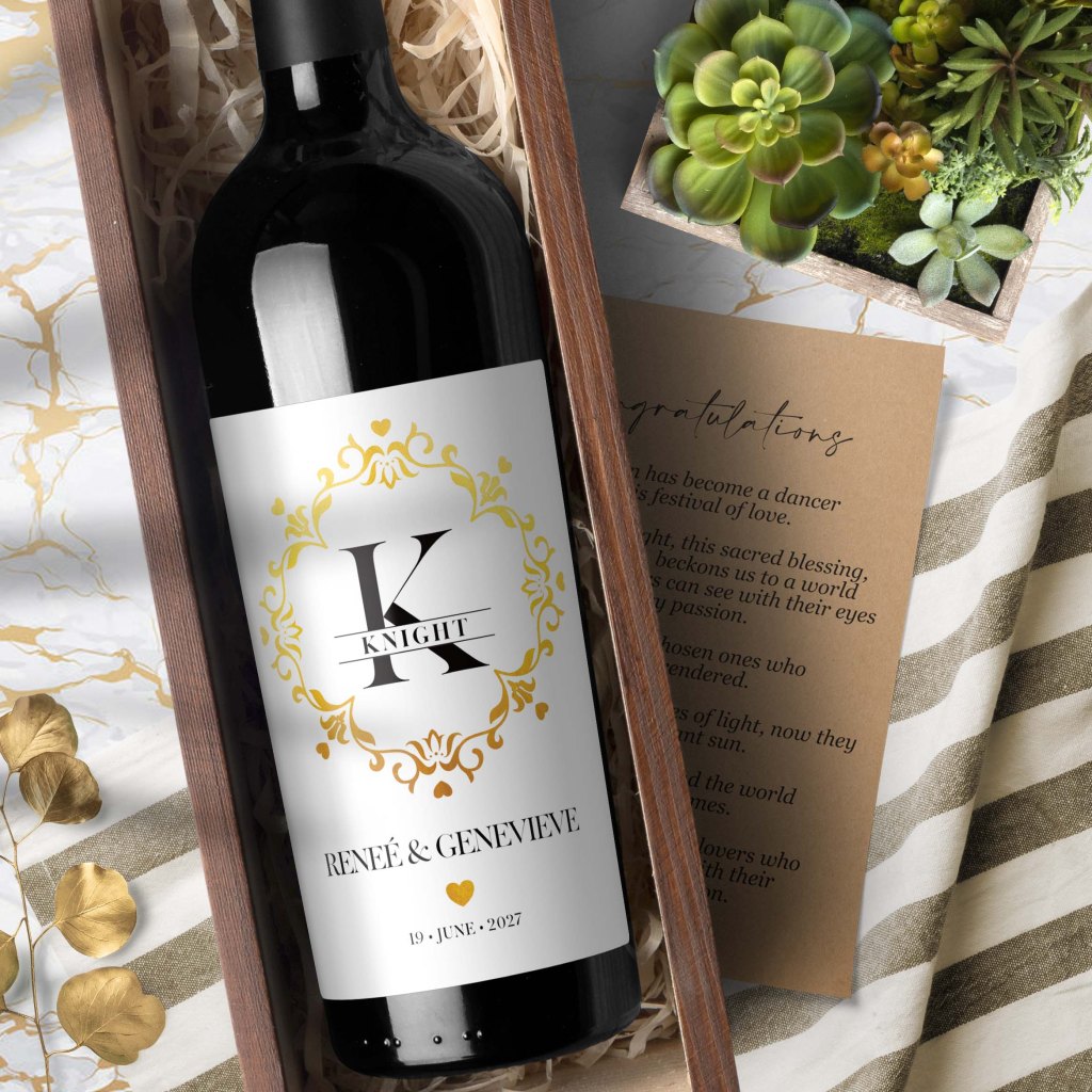
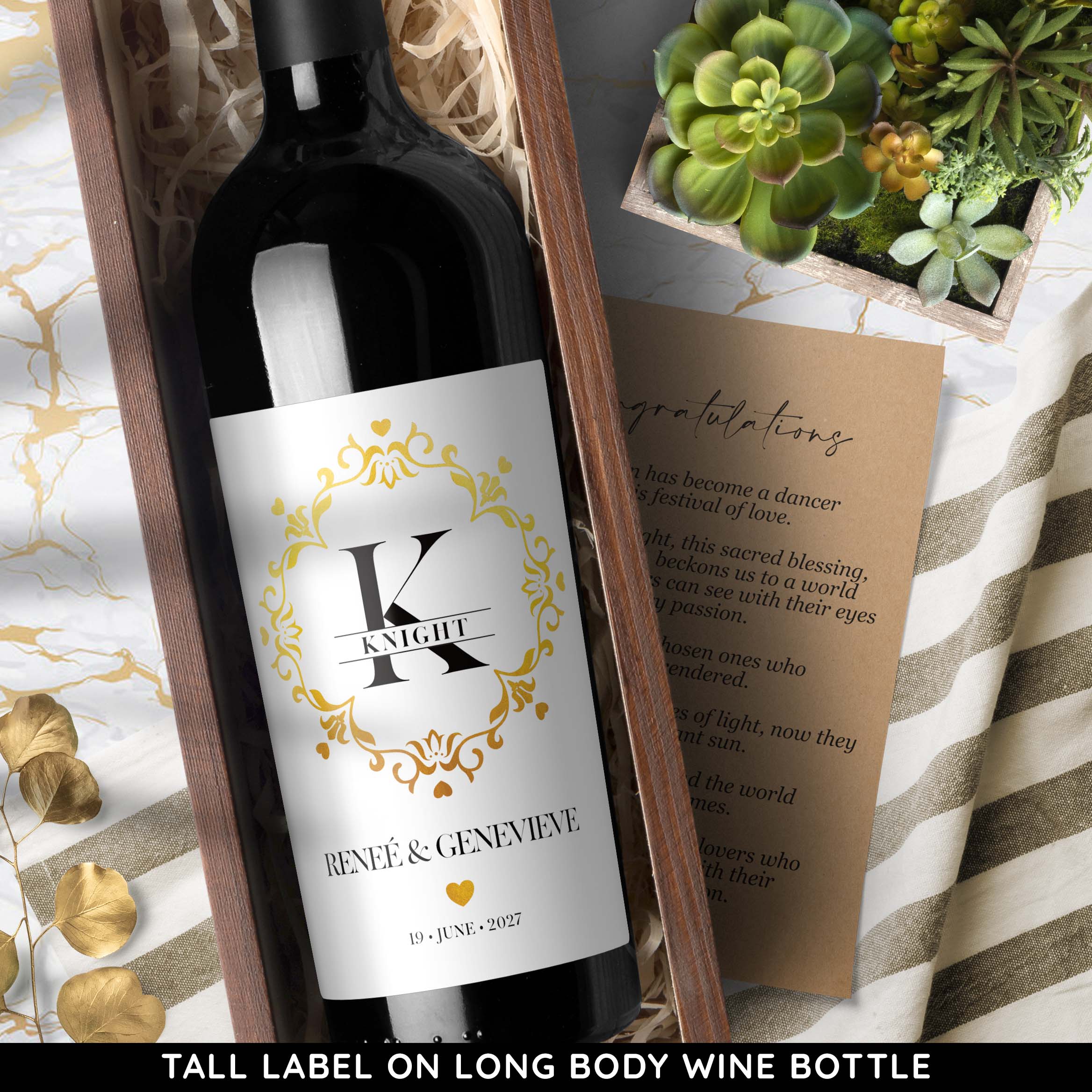
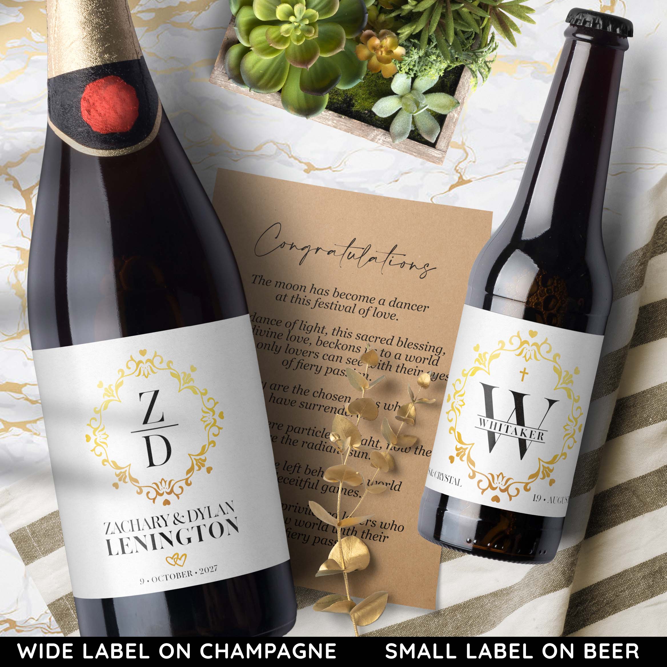
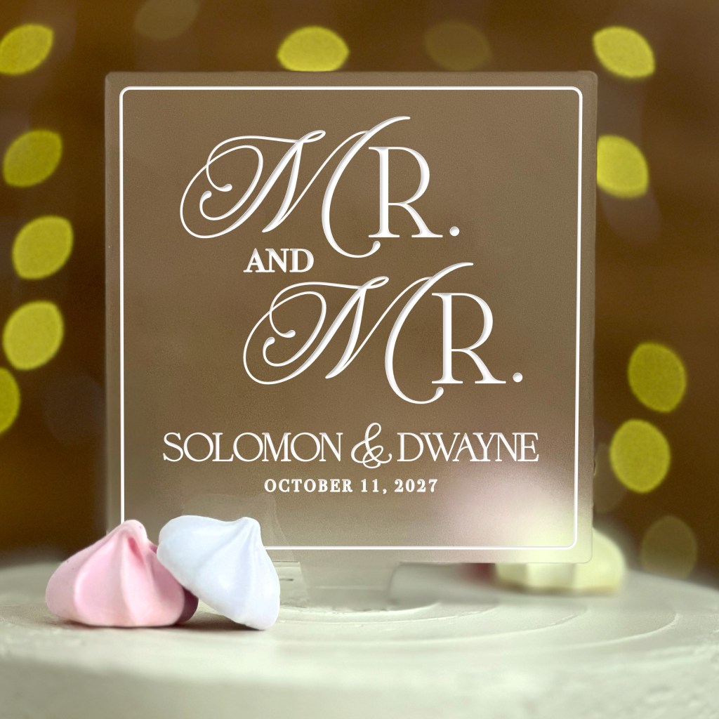
From the start I wanted two layouts. The first is the one you see here: a single bold initial centered in the frame, last name banner cutting through. Classic. Confident.
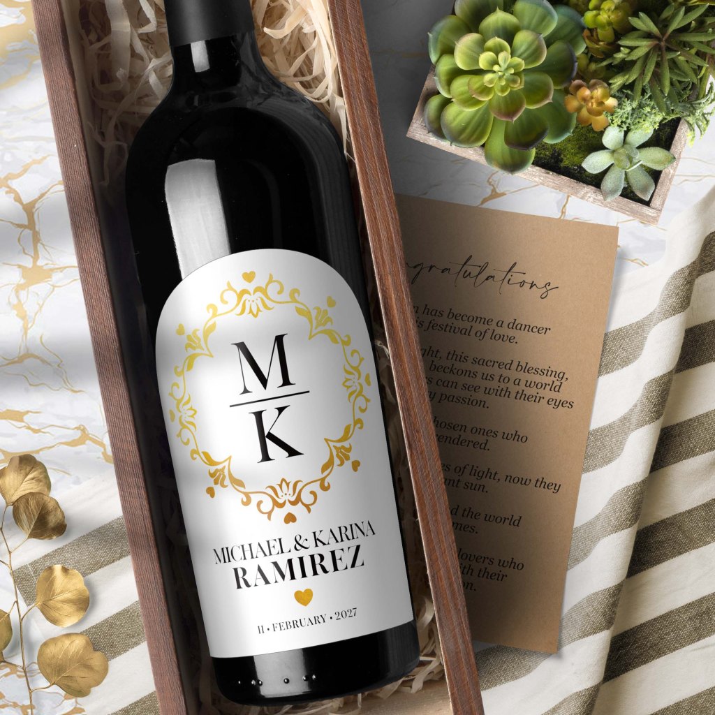
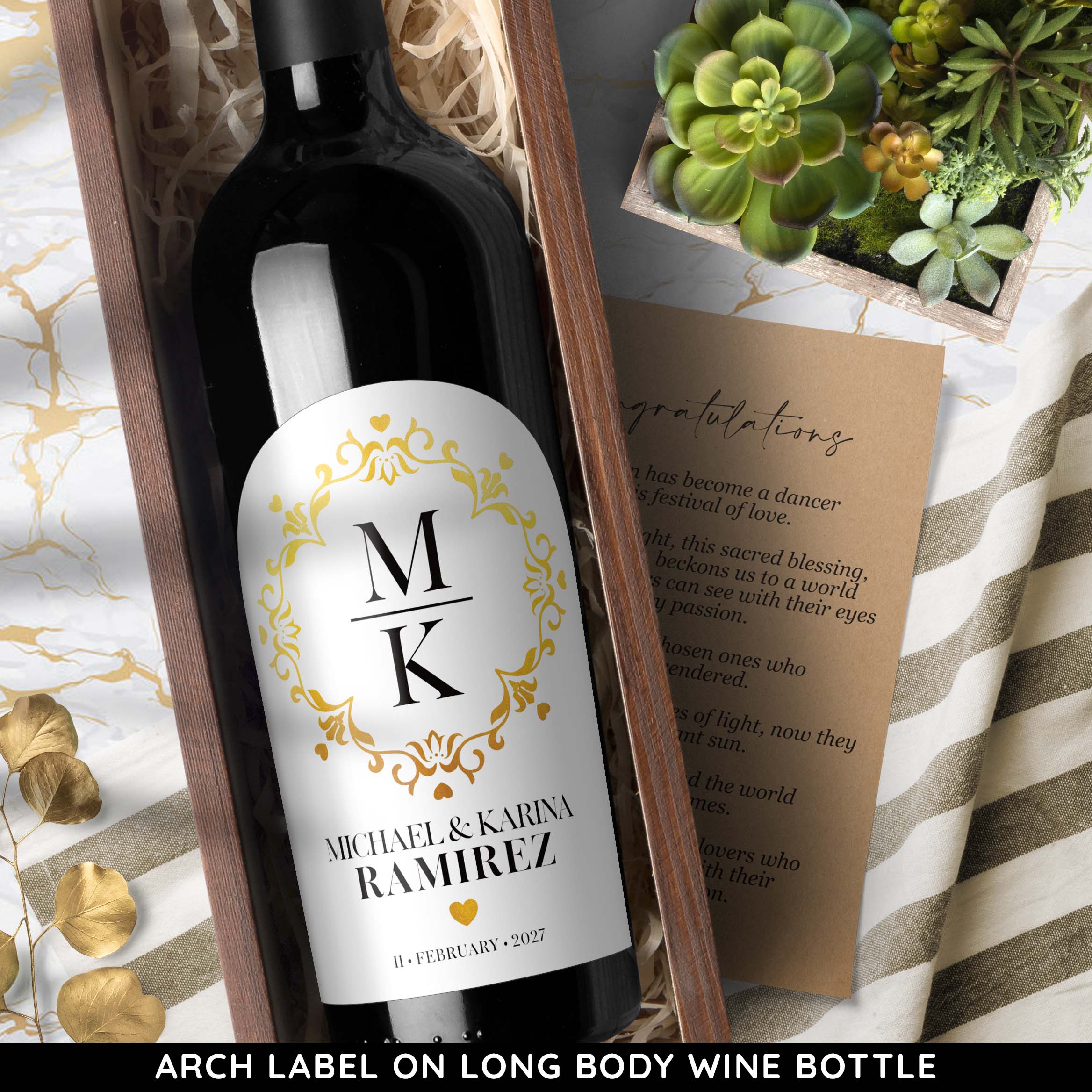
The second is stacked. Two initials, one above the other, for couples who want something more modern. Same frame, same gold, different center.
Black, Gold, White (Maybe Black)
The palette I never wrestled with. Black and gold on a white background. It’s what this design wanted from the first sketch.
The gold isn’t real foil. It’s a printed simulation, a gradient and a finish that read as foil at a glance, on a weather proof gloss adhesive label that ships in days. I spent more time than I’d like to admit getting it to look convincing.
After I launched the product on ETSY this morning, I’ve been wondering if the design is asking for a black-label version. Black background, gold frame, white type. The bones are there. I can already see it.
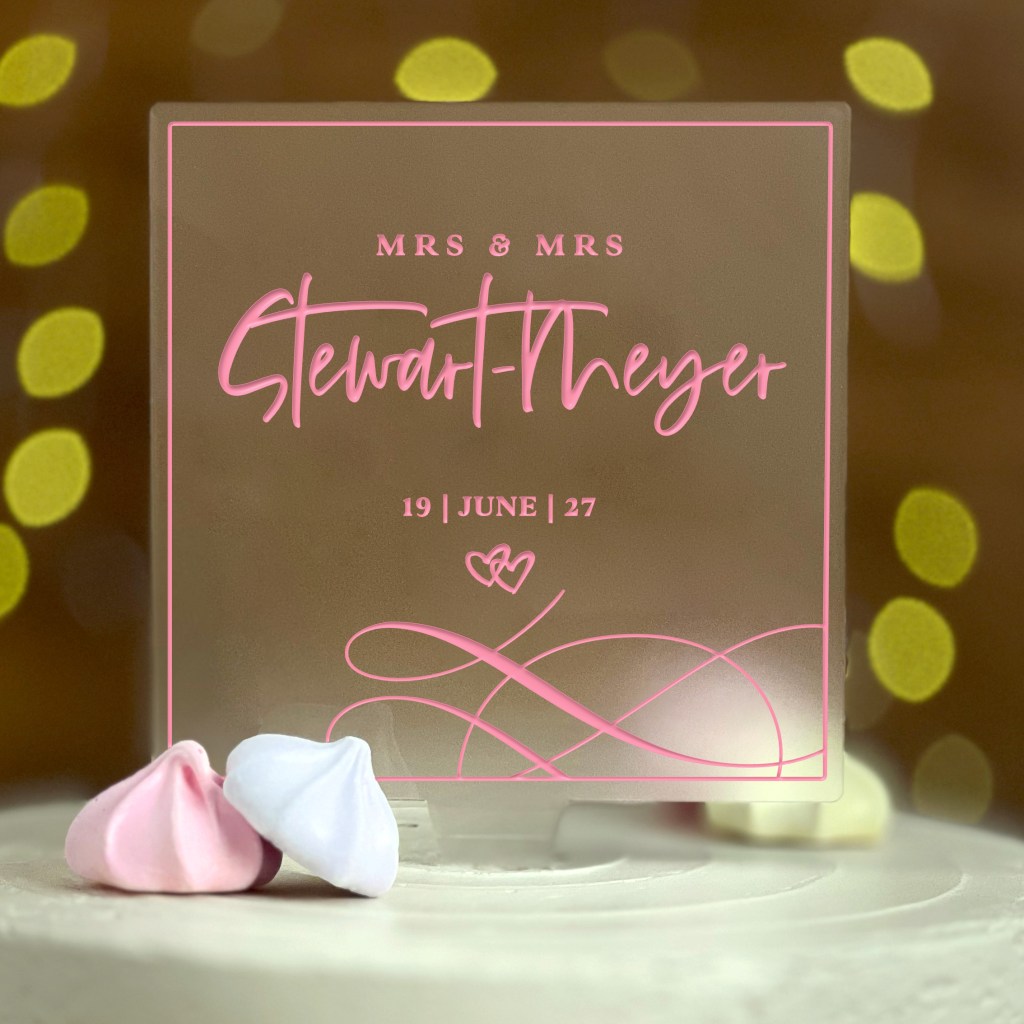
RENEÉ & GENEVIEVE, JUNE 19, 2027
The names are illustrative. The date isn’t random. June 19 is the day Derek and I got married. Whoever ends up in this frame, I hope it feels like theirs.
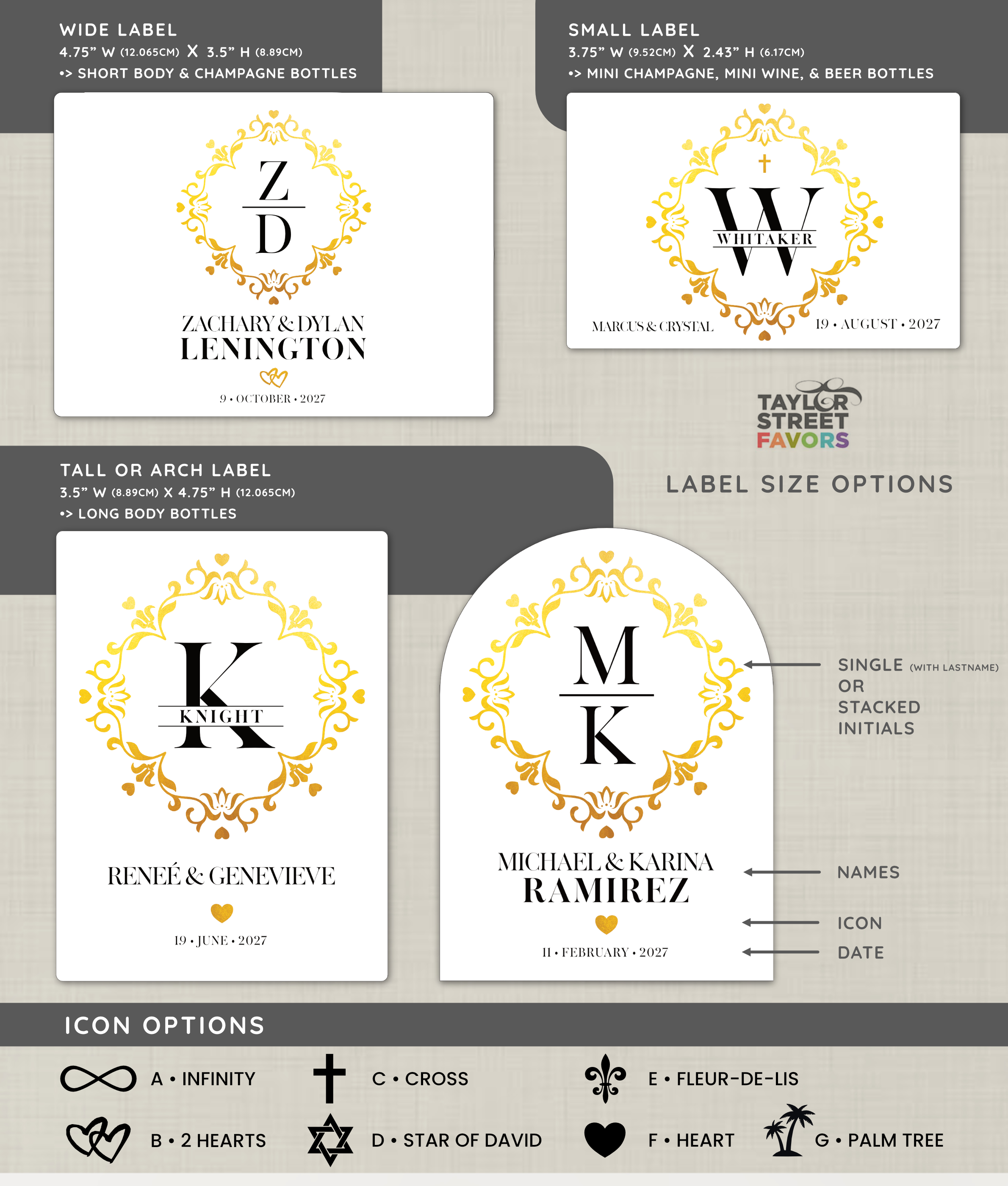
Designing for Four Sizes at Once
I always start with the Tall label. It’s the format I think in. Then I resize for Wide, Small, and Arch.
Does it always work? No. A frame that breathes on a Tall can suffocate on a Small. The Arch wants a different center of gravity. So I go back and adjust. The trick is keeping the other three sizes in mind while I’m still drawing the first one. If I forget they exist, I pay for it later.
Send Me Your Initial
Place your order with your initial (or two, for the stacked version), names, and date. I’ll send a proof within 24 hours, and nothing prints until you approve it.
See the Monogram Wedding Wine Label on Etsy →
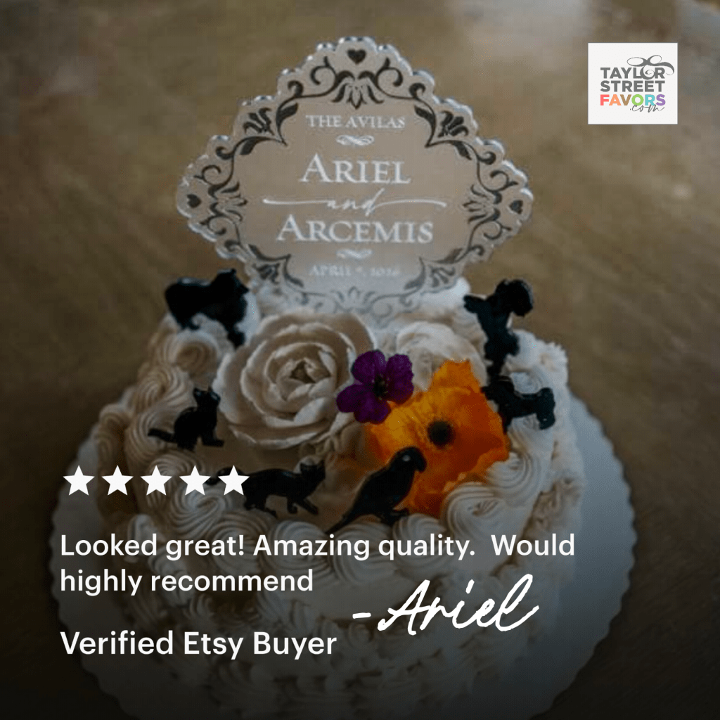
The version in my head and the version on the screen finally agreed. That’s a good day. Now I think I’ll make it into a cake topper!


Leave a comment